The Challenge
As a medical device and education company grew, its team tried to accommodate new offerings by launching multiple websites with different messaging for different groups of users. This method ended up confusing users who ended up on the wrong site and weren’t finding the information they needed. In addition, the company did not have capacity to maintain each site.
Solution
Create a unified experience with specific goals and features to serve each user group:
certified doctors purchasing exclusive instruments
doctors applying for certification and
the general public seeking specialized procedures.
The Process
Discover
Stakeholder Interviews
Business Objectives
User Feedback
define
Personas
User Stories & Flows
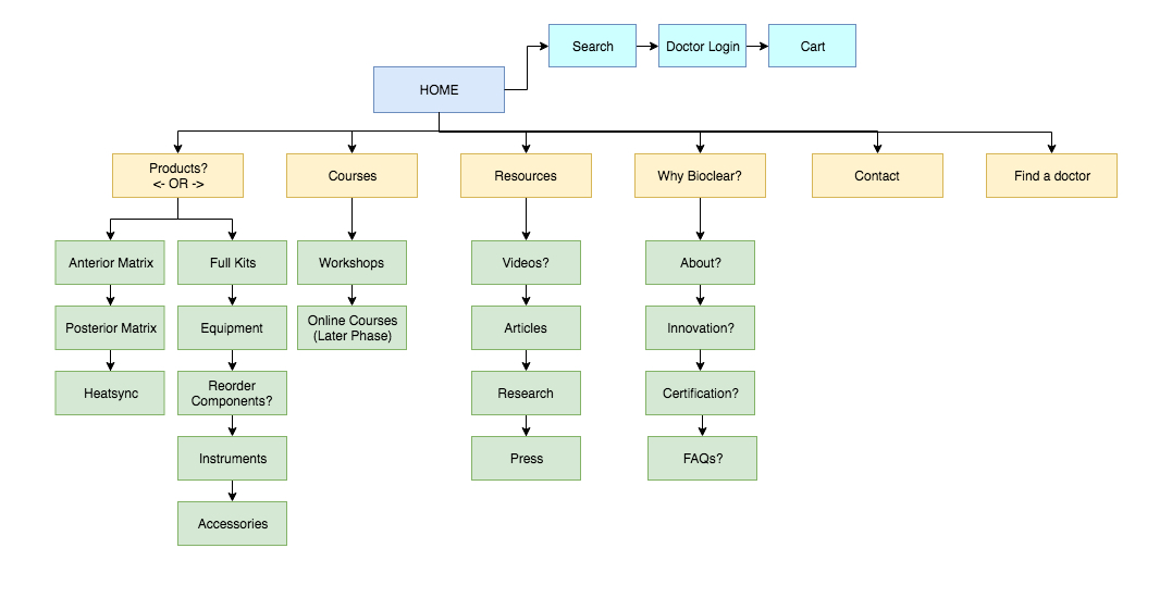
Information Architecture
Create
Wireframes
User Interface
Visual Design
Style Components
User Personas
Research for personas included analytics, order data and customer service feedback to create three main profiles. One important finding involved understanding that each user type was very well-researched. The products and classes that the client offered were very specialized and anyone interested was not just casually looking around for advice or ideas. They were definitely looking for solutions.
JESSICA - THE TOP DENTIST
Bio: Jessica is interested in offering the most innovative services to her patients, who she calls clients. She wants to have a reputation for being at the top of her field performing cutting edge procedures. There are only about 500 doctors based in the USA and 1000 internationally-based doctors who are certified in this company’s methods.
Motivations: She wants her staff to be able to order products for her practice quickly and easily. Her office is always busy and her staff doesn’t have time to spend too much time online. Ordering and registering usually takes place from a tablet or desktop computer while at the office by the office administrator. She also wants to continue to the next level of certification to offer more care for her clients.
MARK - THE CURIOUS DOCTOR-STUDENT
Bio: Mark went to a conference with Jessica and is impressed by her successful practice. He’s interested in learning more about the courses she has taken and how they have helped grow her business. He has a few clients who would benefit from the procedures as well. More and more clients are asking about cosmetic improvements that are cost-effective and don’t involve implants, dentures and more invasive surgeries.
Motivations: Mark wants more details about the courses offered. He has some questions he wants answered. Is this a training he could logistically take? What are the costs? Where is it located? When do they take place?
ROGER - THE RESEARCHER-PATIENT
Bio: Roger heard about the company while searching for dentists and procedures that are both cosmetic and clinical. As he gets closer to retirement, he wants to improve the look and health of his teeth. His career allows him to invest in his health, and he’s used Invisalign and some whitening products in the past. He’s also conscious of not wanting to do any work that is too invasive or harmful.
Motivations: He’s looking for ideas and wants to see images of real results. He is willing to dig into the research, find just the right doctor to do the work and the right procedure that matches his specific needs. He may start out on his mobile device, but switch to desktop to do some additional searches.
User Stories
Examples WITH Wireframe & DESIGN screens
Jessica, The Top Dentist, trained on a new technique and wants to order new products for her practice. She has specific colors in mind to match her brand and she would like to save these to the office’s account so her staff can order in the future.
Roger, The Researcher-Patient, wants to search for doctors in his area. He wants to know what level certification they have and see images of their work.
Mark, The Curious Student, is ready to sign up for the next certification course. He’d like to be able to filter all the events to see just Level I courses during a time he’s available. He doesn’t want to travel too far, but is open to seeing what location options are available.
Navigation
Home Page Design
Some of the visual design elements are intended to have an organic shape similar to teeth and elements such as buttons and cards are rounded to add to this look. The client was looking for a “friendly, but medical look” which brought out the clean, white backgrounds and vibrant colors with a slight gradient. Card styles are utilized to help actionable and interactive content stand out to users as they move through the site.


